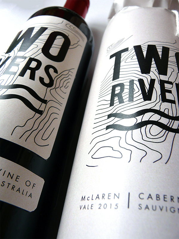
Two Rivers
Wine label and packaging
The Two Rivers brand is built around the idea of sharing, conversation and the meeting of friends. Two personalities, tones, groups (rivers) can run parallel or converge to become greater than their sum. I wanted to capture this expression and emphasise the companionship celebrated when enjoying quality wine. The topographic map element speaks of the landscape these friendships form; valleys and mountains, moments and memories. Two Rivers wine should be enjoyed with company, shared and remembered like love and friendship.
I worked within self imposed budget constrains and thought ultimately about the target market and final retail price point. This influenced me to use a one colour graphic and a paper wrap for the packaging. The wrap for the bottle is understated, with a humble sensibility. This packaging solution allows for a larger canvas for shelf presence whilst presenting as a pre-wrapped gift.