Listen Hear Festival - PADC Student Skulls Finalist
2016 PADC Listen Hear Festival
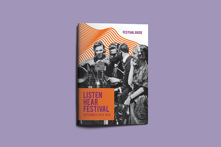
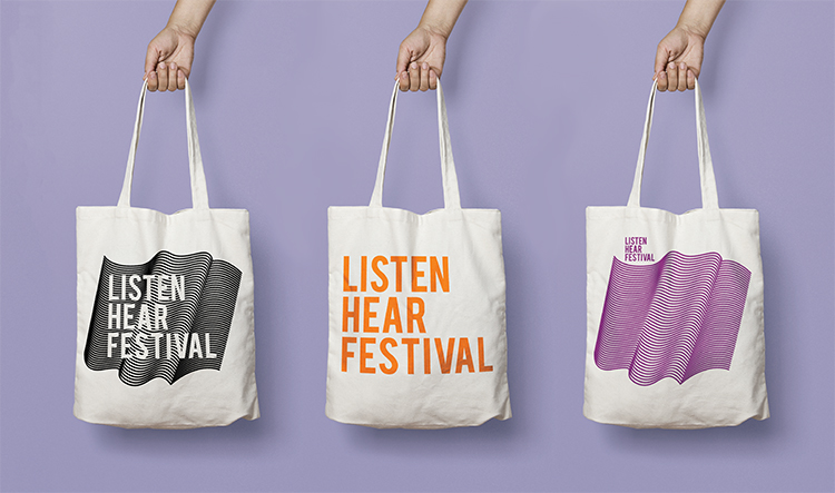
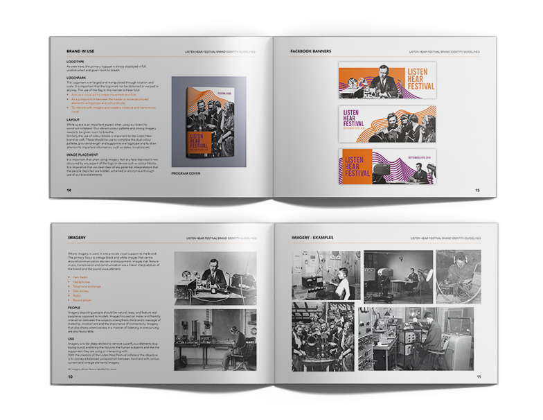
Brief: Propose a brand identity for ‘Listen Hear Festival’ that encourages attendance and creates conversation about youth mental health, particularly in young men. Deliverables: logo, identity system, style guide, printed materials, branded merchandise
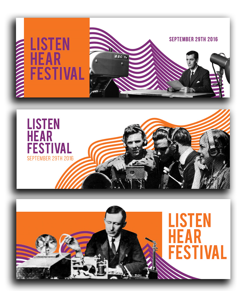
From the outset I was conscious the branding would need to appeal to many different people, who have different tastes, attitudes, and styles. To solve this problem I purposefully steered clear of depicting people, elements or styles that strongly indicated a genre or overarching theme of the festival, e.g. street, low brow, hip-hop or dance. Similarly I realized that the branding would have to be recognizable though adaptable across different platforms, mediums and to promote different acts and speakers.
The pattern or ‘flag’ is graphic representation of a sound wave which is a visual tie to the brand name. The undulating sound wave encapsulates the highs and lows of life and of the effects mental health issues can have on the human psyche. The sound wave being reminiscent of a flag is symbolic of solidarity, of strength and of perseverance. The potential to use the logomark as an illustrative device and the combinations possible with the colour palette keeps the brand recognizable while still being energetic, adaptable and alive. The logotype is structured and uniform providing contrast to the flow of the flag. It is direct and resolute. The colour palette and logo is a rejection of how mental health is viewed in our society. I wanted to show the Listen Hear Festival as vibrant, loud, strong, steadfast and unashamed.
