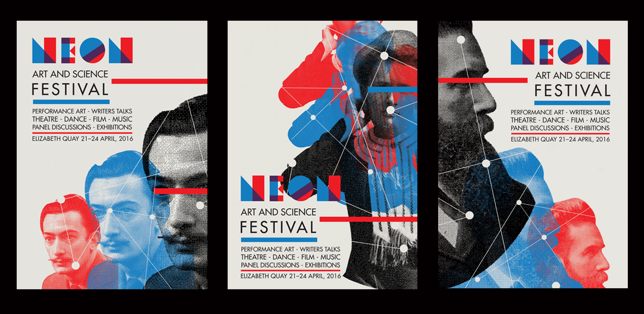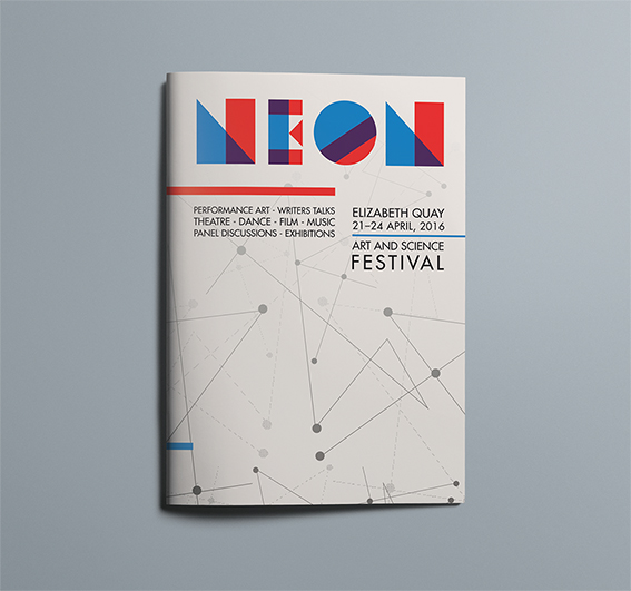
Neon - Art and Science Festival
Logotype, branding and advertising for Neon Art and Science Festival
Neon Art and Science Festival is an exciting, energetic event that aims to showcase the overlap in science and art. I focused on creating a recognisable identity system which allows for adaptation and variation across mediums and formats. The logotype makes use of geometry and colour interaction and is the literal interpretation of ‘where art and science meet’.Colour choice for the festival is based on anaglyph 3D. The treatment of the portraits follows this idea with the trick of the eye expanded through the separation of the red and cyan. A reveal, or working of this phenomenon is implied through its deconstruction.
Recognisable imagery of famous scientists and artists make clear the focus of the festival while the use of illustrative devices allows for an adaptable and living identity. The ‘map’ device is representative of points of interest, connectivity and knowledge. Drawing on inspiration from scientific maps, charts and data, this device works to create a relationship between elements.